Brand
Brand Guidelines
Resources and guidelines for presenting the Coreworks brand consistently. Download our full asset kit or copy individual SVGs directly from this page.
Download brand assetsNaming
“Coreworks” is a single word, always spelled with a capital “C” and lowercase “w”. It is the brand name for both our company and our product. Do not abbreviate it to “CW” or split it into two words. When referring to specific product features, capitalize them as proper nouns (e.g. “SuperAnalyst”).
Usage
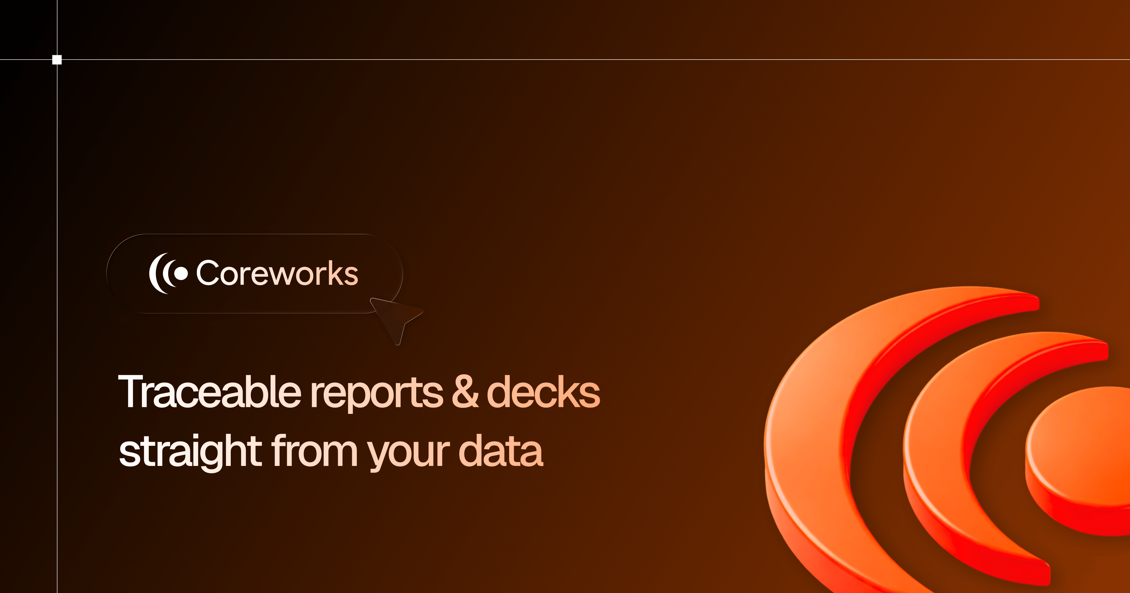
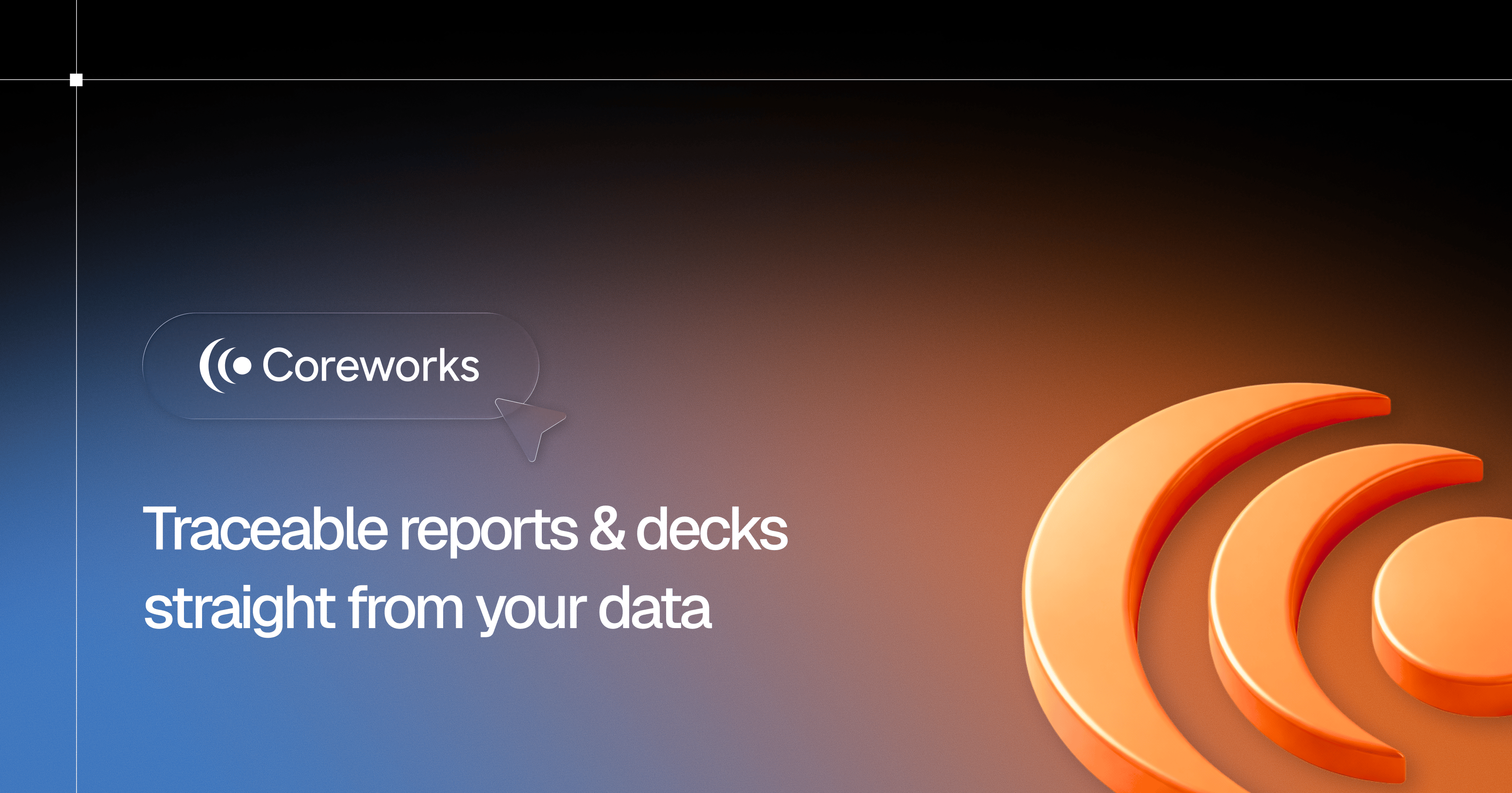
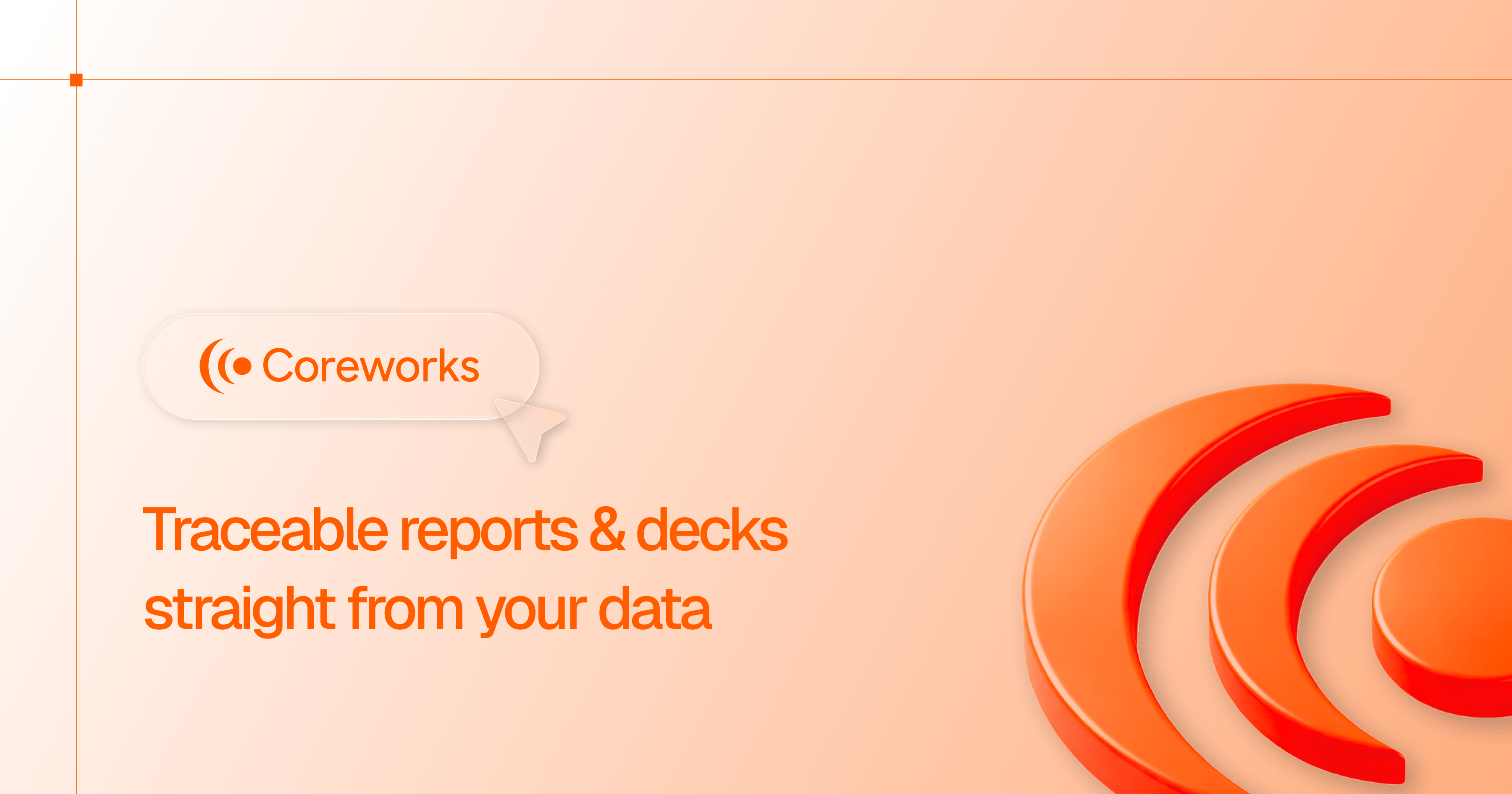
Provide plenty of space around Coreworks assets. Make them big or make them small, but give them room to breathe. They should not feel cramped or cluttered. Do not rotate, distort, add effects to, or recolor any logo assets beyond the approved variants shown below.
The provided graphics are proprietary and protected under intellectual property laws. Do not alter these files in any way, display these graphics in a way that implies a relationship, affiliation, or endorsement by Coreworks of your product, service, or business. Do not use these graphics as part of your own product, business, or service's name, or combine these graphics with any other graphics without written consent from Coreworks. Get in touch if you have questions.


Colors
The Coreworks palette is anchored in black and white with two accent tones. Core Orange is the primary brand color, typically reserved for key accents and gradient backgrounds. Signal Blue is used for interactive and data-driven contexts.
Graphite
#212124
RGB: 33, 33, 36
Core Orange
#EE5101
RGB: 238, 81, 1
Signal Blue
#388FFF
RGB: 56, 143, 255
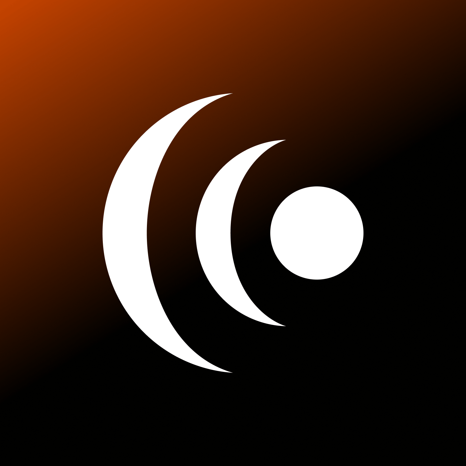
Gradients
Used sparingly for hero backgrounds, avatars, and key brand moments. They should always transition smoothly and feel intentional.
Ember
#EE5101 → #000000
Sunrise
#FFFFFF → #EE5101 → #000000
Signal
#000000 → #388FFF
Typography
Three typefaces form our type system. Reckless Neue for display headings, Geist for body and UI, and Geist Mono for code and data.
Ag
Source Serif 4
Display / Headings
Light, Regular, Bold
Ag
Geist
Body / UI
Regular, Medium, Bold
Ag
Geist Mono
Code / Data
Regular, Medium, Bold